 A [slightly] more serious post than usual:
I have been considering beauty, and our perceptions of it. In looking over the many compliments about my SWAP that I’ve received, here and on Facebook, it’s been interesting to see which items really seemed to make a lot of people happy.
I had thought that the lilac ensemble would be the show stopper, but the purple tail bodice seemed to blow people’s socks off. The green riding jacket also seemed to cause a fair bit of excitement, so that ruled out the colour as the deciding factor. I decided it must be to do with the proportions.
As a maths teacher with a strong artistic leaning, I’ve often spent time linking maths to art [and no, *sigh* that doesn’t have to mean studying perspective.] At university, I took a course on ‘the History of Maths’ for which we had to write a sizeable essay/project/whatever. While most people went for ‘Roman Maths’, ‘Greek Maths’, or studies of famous mathematicians etc, I chose ‘The History of Maths in Art’ and had a lot of fun.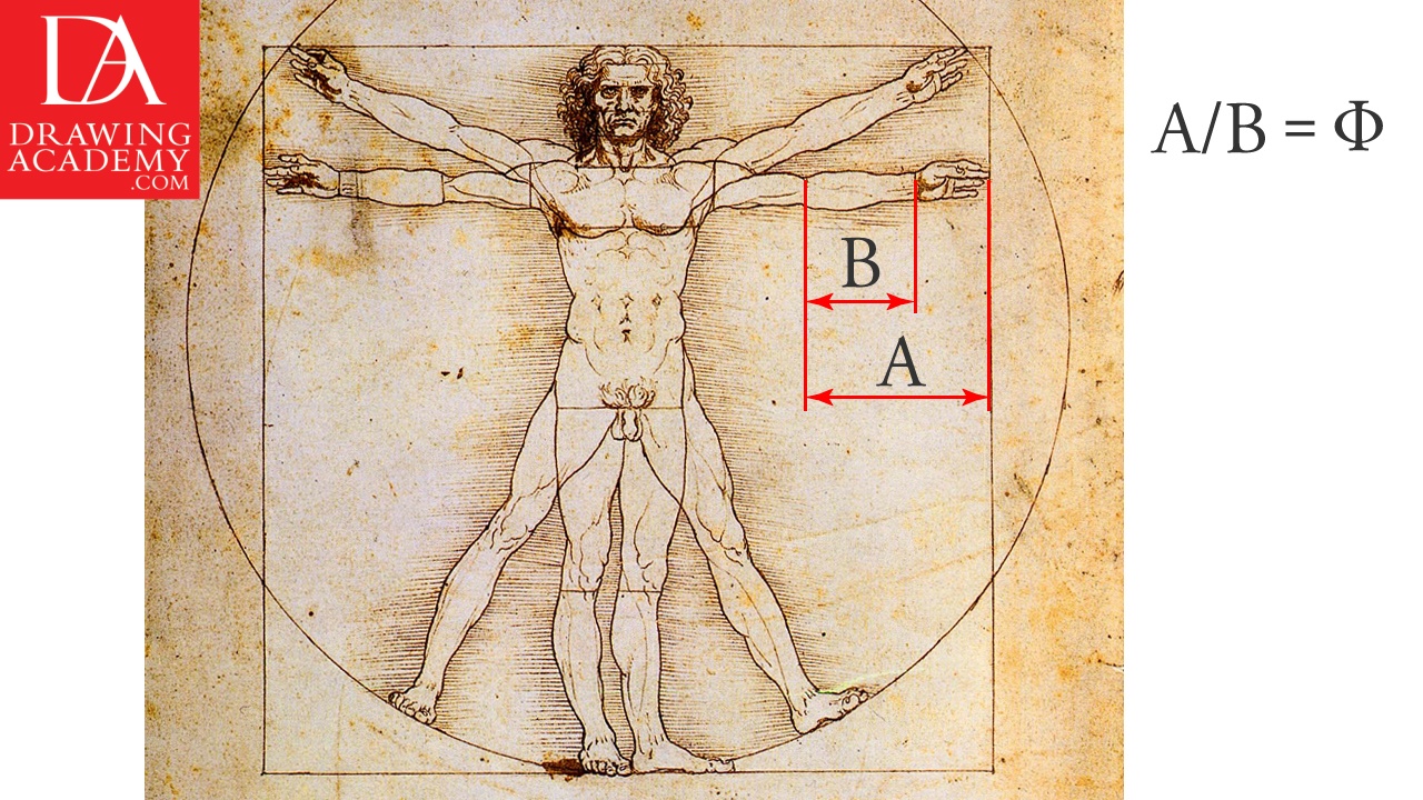
Part of this focussed on proportion and harmony, and along the way I found a cute little teaching activity which I’ve used in many classes over the intervening years: A Rectangle Beauty Contest.
This is what you do: hand out loads of large sheets of paper, rulers, and pencils to the class, and ask every group to produce, let’s say, six different rectangles on their sheet. They can be drawn in any orientation, and any size [although not too small please!]
You allocate every student maybe three votes, and ask them to go round the room, having a good look at all these lovely rectangles, and place their votes for 1st, 2nd and 3rd most beautiful. Count up the votes, and then get them doing some measuring and calculating.

For every rectangle they have to carefully measure the height and width, and divide the longest by the shortest.
You then take a deep breath, and see what the results are for the most beautiful rectangles. [You could add in an ugly-bug ‘prize’ if you want to]
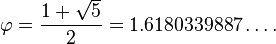
With luck, and this usually works if the group is accurate enough, your most beautiful rectangle will have produced a very special number, denoted by the Greek letter phi ( or
or  ) , the golden ratio. Its value is:
- The ancient Greeks loved this, and produced much of their architecture to be in this proprtion. We use it in a rough sense, without even realising: it is roughly one and two thirds, or 5/3. We use fives and threes a lot when arranging things harmoniously, it just looks right doesn’t it? Placing waistlines, hemlines etc in ways that ‘look good’ often divides the finished garment, or the body, into 3/8 and 5/8 [0.625] , or 2/5 and 3/5 [0.6], which are both close to

- Wow! So to test my theory, I now need to do some measuring on my collection of outfits and see if my theory is collect. Maths geek time!
- PS: yes, that is me at work in the top picture…

I’m looking forward to your analysis of the garments you made. I watched a prog recently which posed the question, grossly simplified by me here, as to whether maths was a product of the mind or out there – whether invention or discovery. There seemed to be a measure of fence sitting from the mathematicians, but there were lots of pretty examples from nature, enough to keep me half awake.
LikeLiked by 2 people
Ah! The music of the spheres! I’m not sure if I’ll find anything, I was just intrigued lol
LikeLike
It will be interesting to see if there is math behind why we like the ones we do. Also, with art, I feel like some people appreciate art that is soothing to them, while others like art that makes them uncomfortable, and it would be fun to find that both camps are unknowingly appreciating the math behind the scenes!
LikeLiked by 1 person
Quite likely- there’s all sorts of geometry behind classical composition [music and art] and introducing dissonance is usually mathematically demonstrable…what a geek
LikeLike
I’m not at all mathematical but I can see how proportion would affect perception of beauty. It will be interesting to see the outcome.
LikeLiked by 1 person
I agree with Kim that this is most interesting. I feel I can see if an outfit is balanced and I am aware of the 1:2 and 3:5 ratios, but I am excited to see what you find. I think Michelle Obama looks great in a full skirted floor length dress, but looks better in a slim fitted dress when it is knee length. Any idea why?
LikeLike
Well all my calculations so far confirm what I expected, but it’s skewed by several factors, including a very small sample, and my own, uneven proportions…it might be fun to set up a bigger version of my rectangle activity, using images of several of us, and roll it out via blogs. Hmmm I’ll be thinking some more
LikeLike
We were taught this proportion thingy on my City & Guilds art course many years ago. Apparently most pleasing landscape pictures have 2/3 land 1/3 sky or t’ other way round. Never investigated further though!! I do have a formula somewhere for the best tunic length which is measured shoulder to knee, divide by 5? and multiply by 3?. Can’t remember offhand but it did roughly correlate with my favourite length on me when I did it.
Set this as a research project for your students and let them do the work!!! 🍻
LikeLiked by 1 person